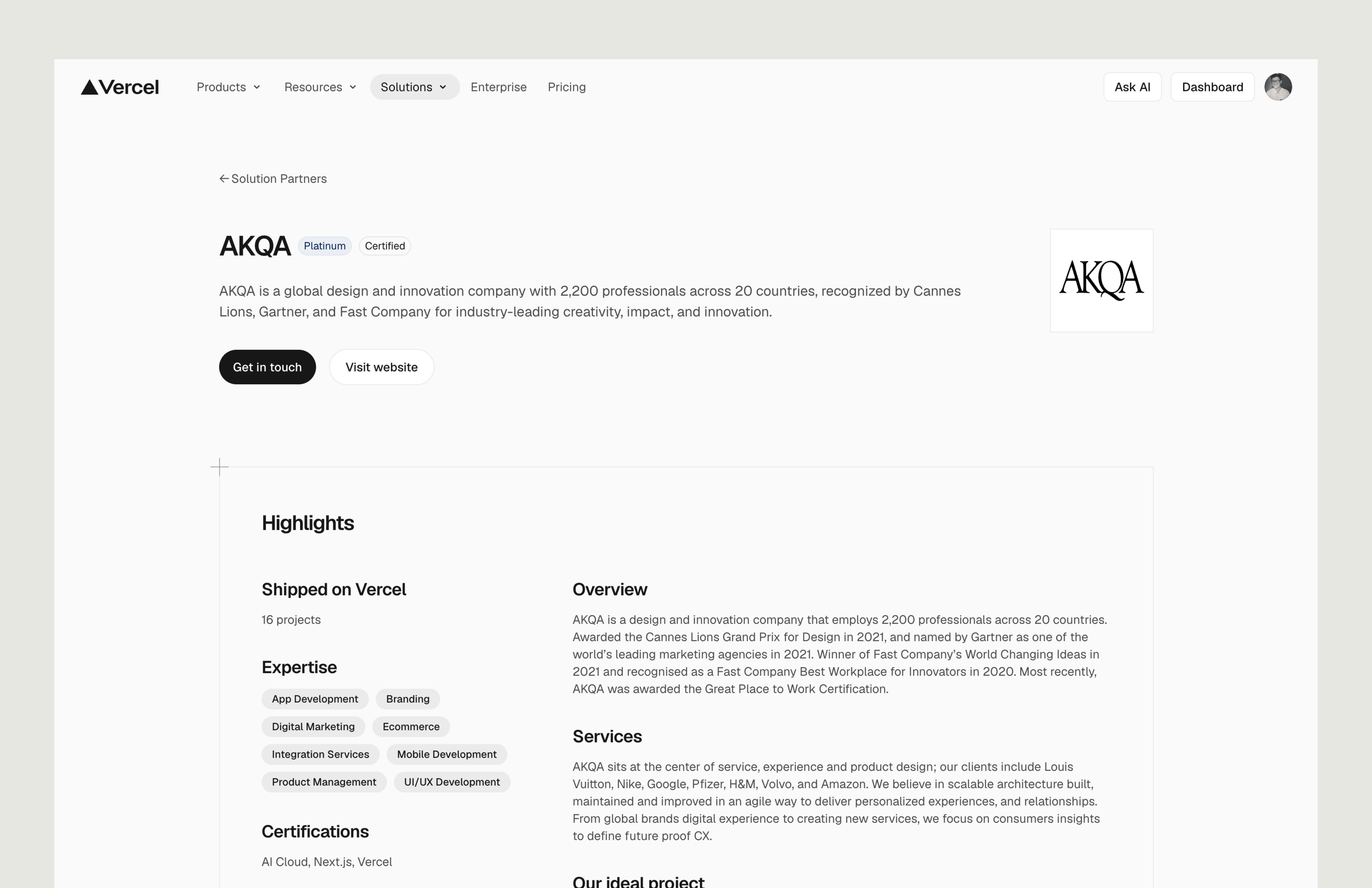
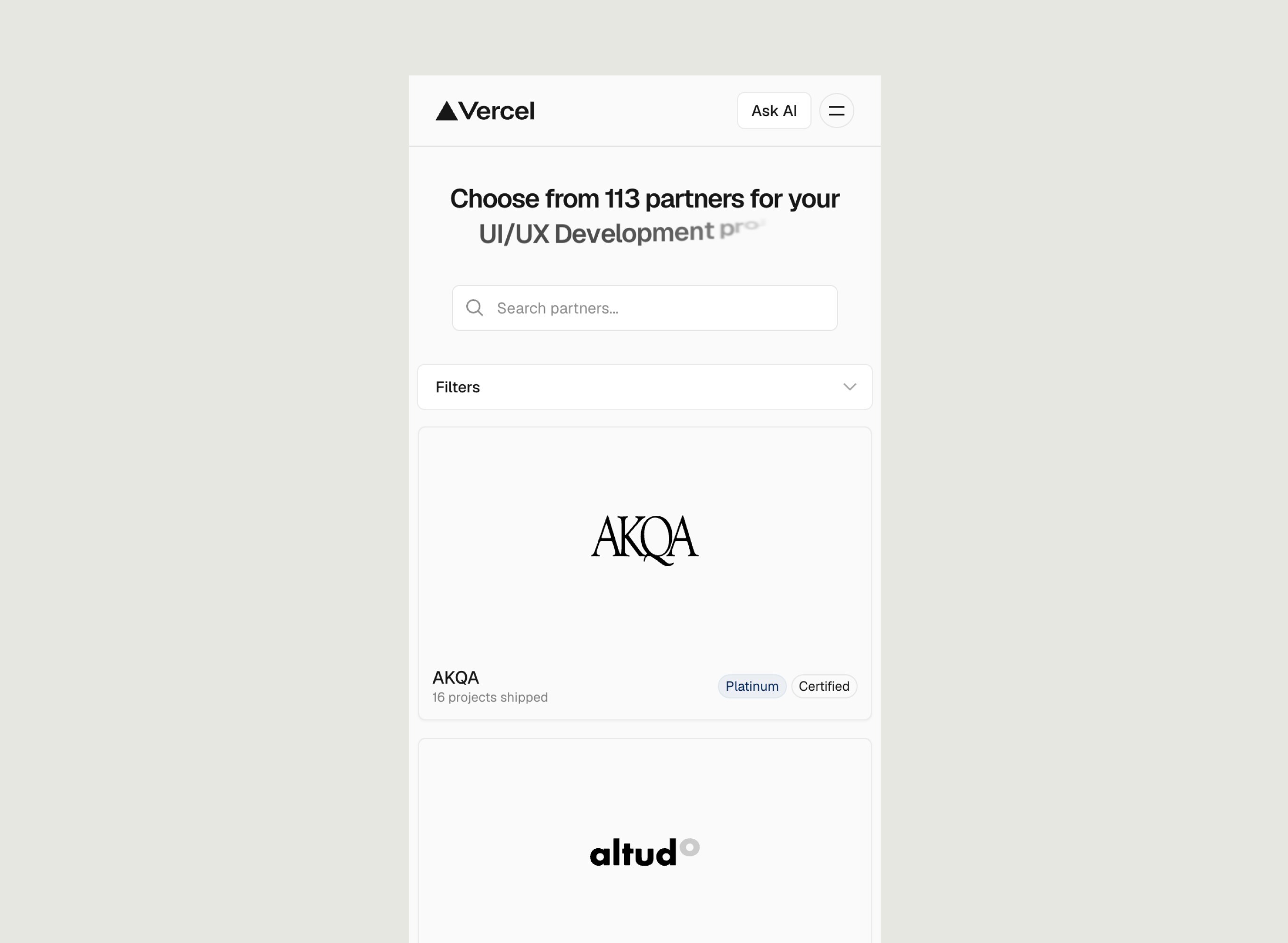
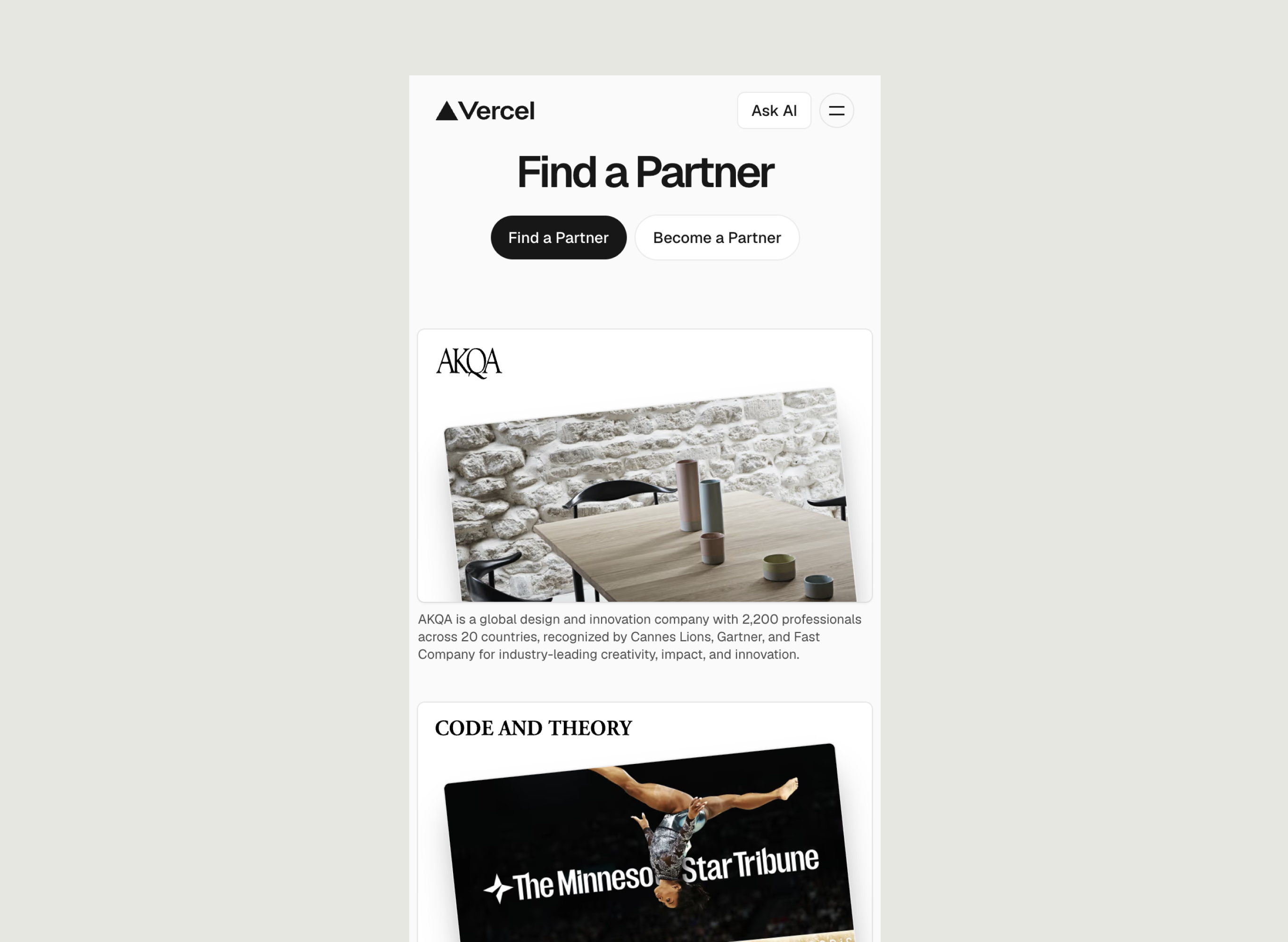
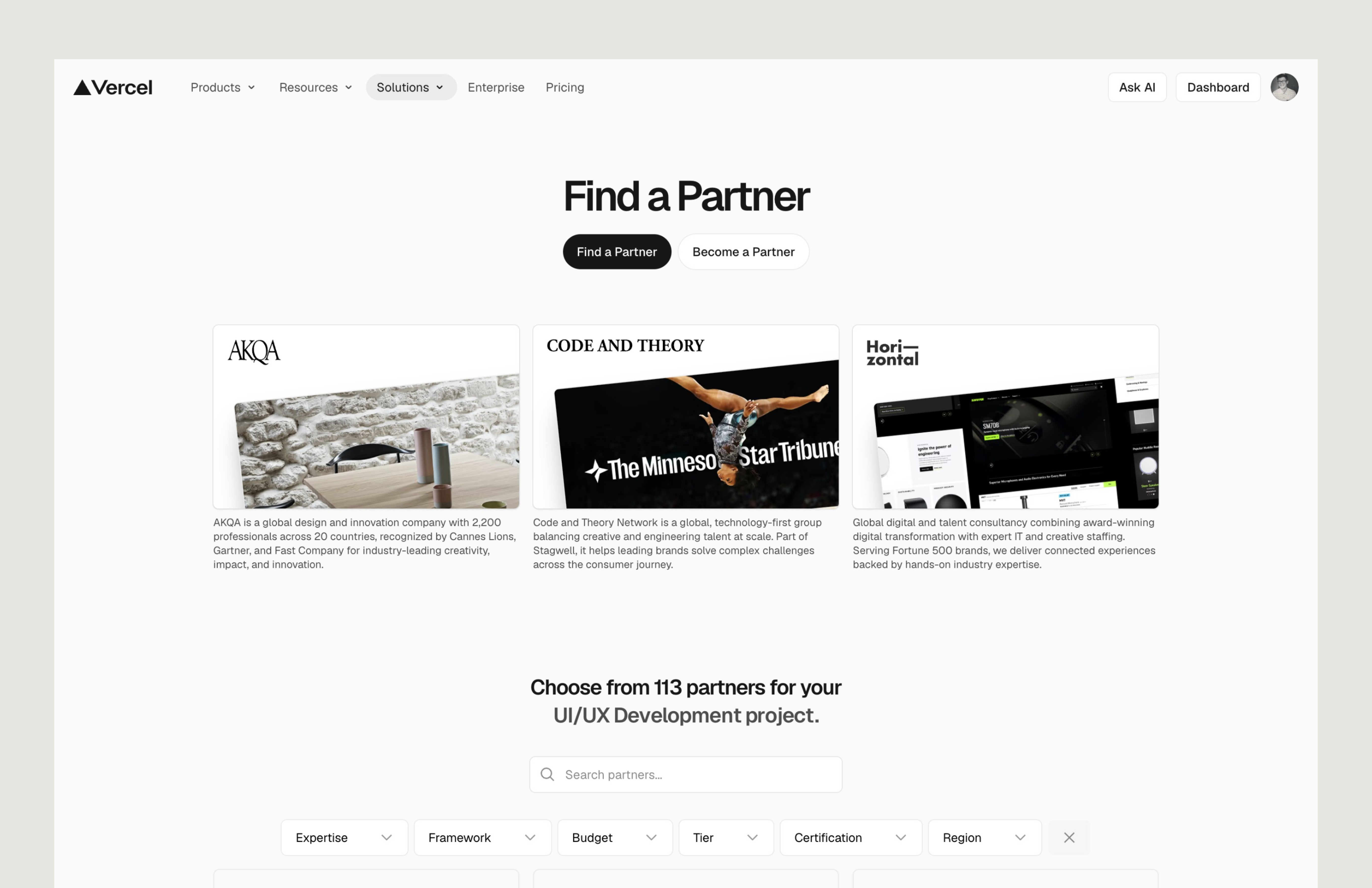
In 2025, I joined forces with Tinloof to support Vercel's Brand Design team on a set of high-visibility pages, most notably the Find a Partner experience, which connects developers and companies with Vercel's growing ecosystem of certified partners.
Working inside a company that has essentially defined what Design Engineering looks like in practice raised the bar. Every decision had to earn its place in craft, in clarity, and in how it scaled across a product used by millions.
In partnership with NYC-based Hopr Studios, I worked with Google Pixel to design landing pages and campaign sites around new product features, translating hardware capabilities into experiences that felt inviting, not technical.
Beyond the screens themselves, the role meant leading cross-functional teams, running UX reviews, and presenting to stakeholders with the clarity that Google's standards demand. It was the kind of project that sharpens how you think, communicate, and ultimately, how you design.


Over two years embedded in Marriott's digital product work, I designed new features and detailed micro-interactions that made the booking and loyalty experience feel more human and more intuitive at every touchpoint.
As much as it was a design role, it was a coordination one: aligning teams, managing competing priorities, and making sure that what landed in front of stakeholders was polished and purposeful. Hospitality at scale means millions of users trusting a product daily, that weight made the work matter.


Following a major rebrand, AGS Health needed their digital presence to catch up. I led the website redesign, translating the new visual identity into a site that was as functional as it was polished, one that introduced the refreshed brand with confidence.
The core challenge was fidelity: making sure the energy and intent behind the new identity didn't get diluted in the translation to screens. Navigation, hierarchy, motion, all of it had to work together.


When XP Inc. launched their credit card in May 2020, the focus was on speed to market. Two years in, it was time to go back and get it right. We identified the friction points, invoice management, feature discoverability, and the complexity of handling multiple cards and redesigned each one from the ground up.
The goal wasn't just a cleaner interface, but a product that actually reduced the cognitive load of managing your finances. Small decisions, compounded across millions of transactions.


C6 Bank was entering a competitive market with an ambitious goal: become the go-to financial management solution for Brazilian businesses. I partnered with their team to design a product built around how companies actually handle money not just how banks want them to.
The work lived at the intersection of user needs and business strategy, requiring close collaboration across product, engineering, and leadership. The result was a tool that gave C6 Bank a credible foothold in the B2B segment and gave me a deep appreciation for designing in high-stakes, fast-moving environments.


